Time spent: 3.5h
Total: 13h/10000h
Probably will be looking into statistics and more math next, to get a really solid math base. Machine learning models will start making much more sense when one knows a lot of math. Besides - math is fun!
Most machine learning courses tend to teach linear regression as an introduction to ML - and I think that’s for a good reason. Linear regression very clearly highlights the main point of what machine learning is at the core - finding optimal parameters for a certain task.
Let’s go back to some mathematics. We know that the equation for a line is , where is the slope of the line, and is the y-intercept. In machine learning stands for a weight and stands for bias. The point of linear regresion is to find the optimal values for and so that the line fits the data as well as possible. Let’s look at an example dataset:
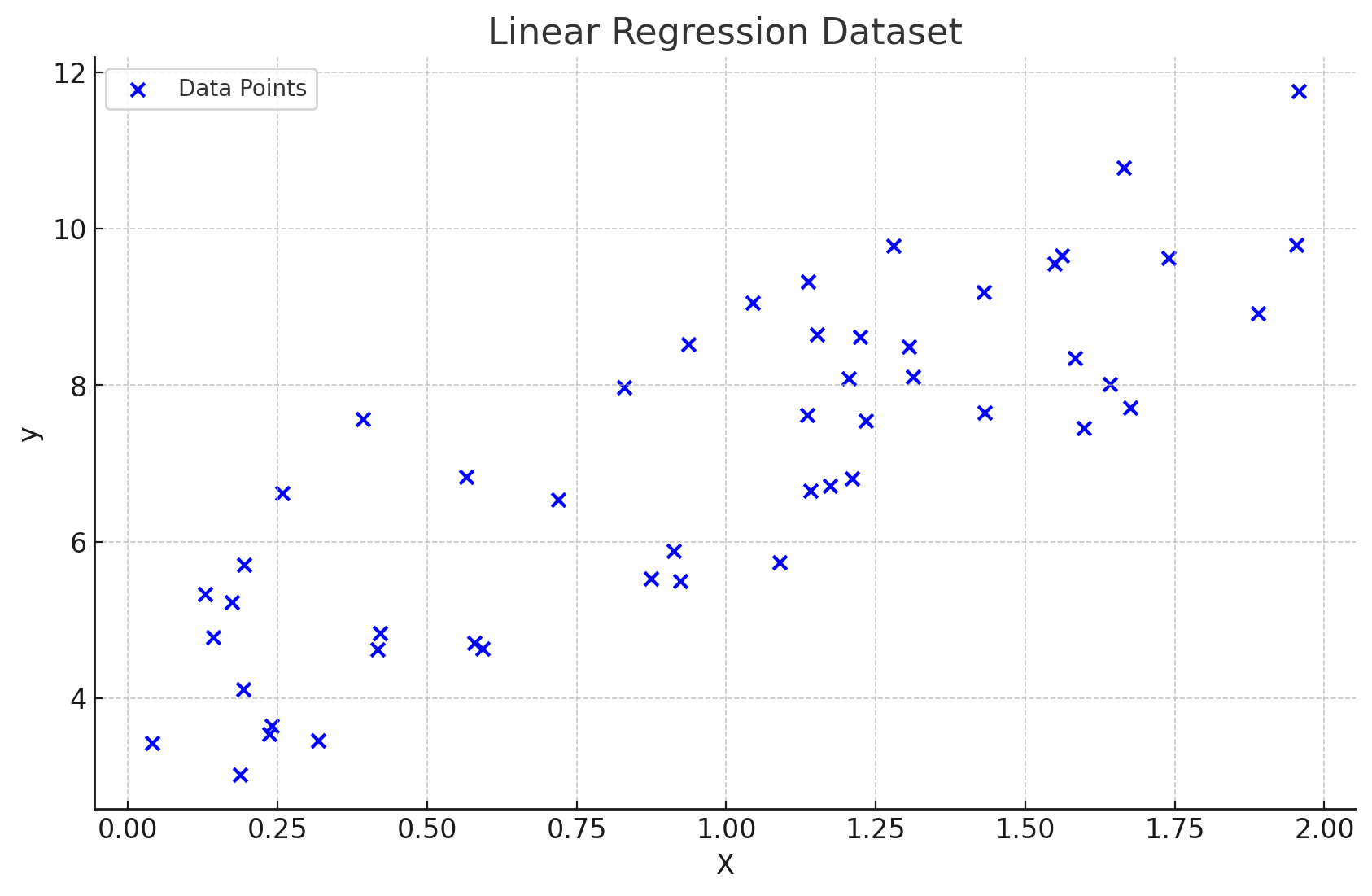
Visualization of a dataset. (ChatGPT/matplotlib)
We have a bunch of labeled data points as our dataset. Labeled means that our dataset contains examples with the “correct answers” for each data point. That’s what’s called supervised learning. Okay. Imagine we added another data point that followed a similar trend to the current ones. We need some kind of mechanism that can (decently) accurately predict the value from just a given value (denoted ). There will always be a slight error in the prediction, but the point is to make the error low enough for the model to be useful:
“All models are wrong, but some are useful.”
A good way to do it algorithmically is by gradient descent. We’ll probably look into it later but for now it’s outside of our scope. Here’s an illustrated example of a similar dataset with a line that is optimally fit for it:
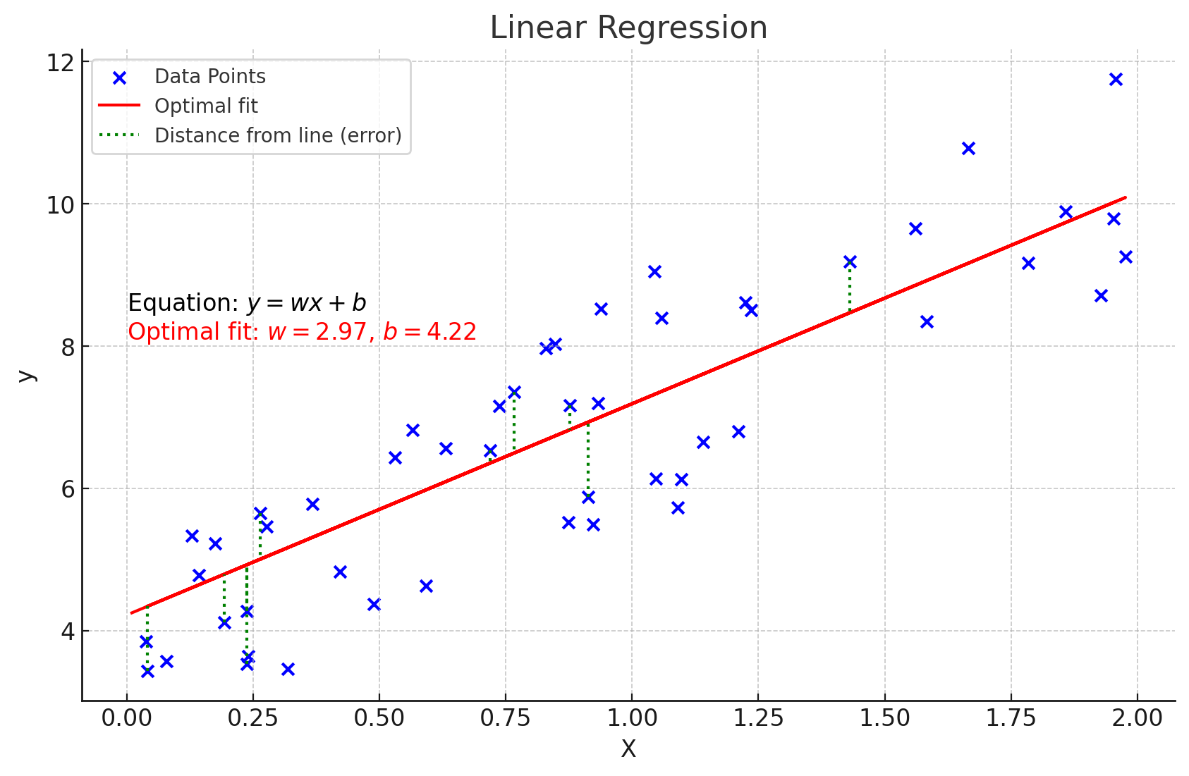
Visualization of a dataset (a similar one) with an optimal fit. (ChatGPT/matplotlib)
See the green dotted lines? That’s called the loss per data point, calculated . The cost of the function is given by the average loss of each data point:
There are many different ways for calculating the loss, the one shown being called mean squared error (MSE). It’s introductory and very simple to understans. We will eventually use it in gradient descent to algorithmically calculate the optimal fit.
Imagine if this was about predicting housing prices. For now we’ve only had one parameter , so we can only represent one of the features of the house. House prices often aren’t that simple to predict. So let’s have more features. Let’s denote our feature vector . for example could represent the area of the property, could represent the number of bedrooms, etc. This is now called multiple linear regression. It is mathematically notated as follows:
where is some feature and is the corresponding weight parameter for the feature.
I tried doing some simple linear regression from scratch with London housing prices in Python to follow the code-centric learning principle. Let’s analyze the dataset a bit first:
import numpy as np
import pandas as pd
import matplotlib.pyplot as plt

df = pd.read_csv("housing.csv")

# only select data points where the area is less than 2000 sqft for simplification
X_filter = df[df["Area in sq ft"] < 2000]

X = X_filter["Area in sq ft"]
Y = X_filter["Price"]

plt.scatter(X, Y)
plt.legend()
plt.xlim(0, 2000)
plt.ylim(0, 1000000)
plt.xlabel('Area in sq ft')
plt.ylabel('Price')
plt.grid(True)
plt.show()
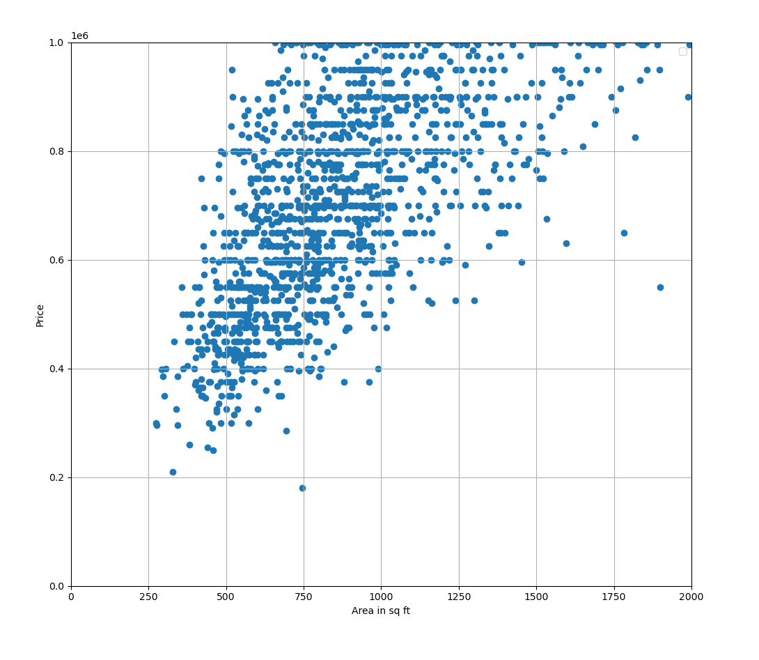
Visualization of the dataset.
Looks like a quite widely spread dataset. Let’s try drawing some lines:
# arbitrary values
w = 800
b = 1000

def f(x, w, b):
    return w * x + b

...

x = np.linspace(0, 10000, 3480)
y = f(x, w, b)

plt.plot(x, y, color='red')
plt.scatter(X, Y)
plt.legend()
plt.xlim(0, 2000)
plt.ylim(0, 1000000)
plt.xlabel('Area in sq ft')
plt.ylabel('Price')
plt.grid(True)
plt.show()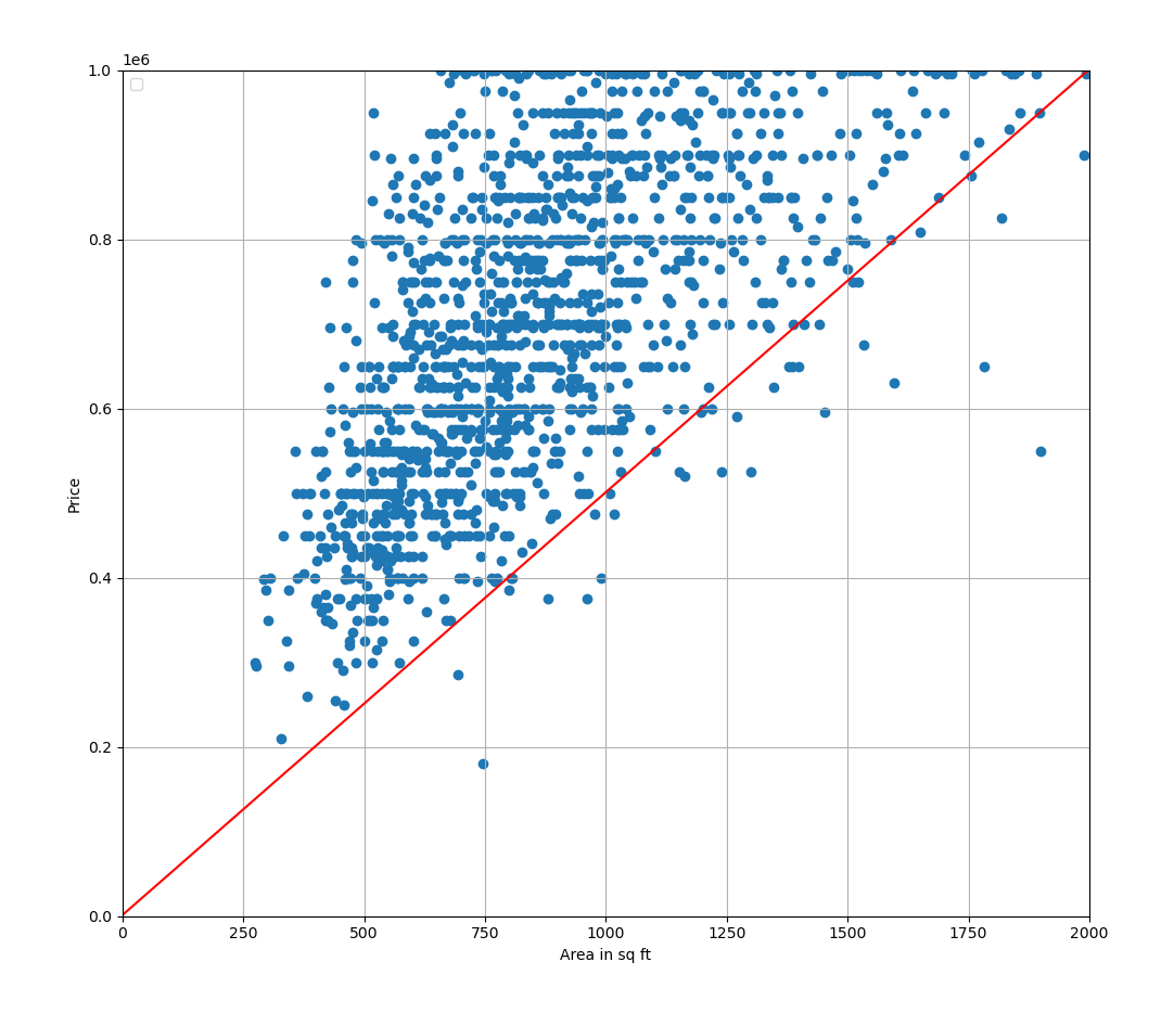
Plotting a line with arbitrary parameters.
Let’s try calculating the MSE for this line:
def loss(w, b, x, y):
    # prediction
    pred = f(x, w, b)

    return y - pred

def mse(w, X, b, Y):
    n = len(X)

    total_cost = 0

    for i in range(n):
        x = X.iloc[i]
        y = Y.iloc[i]

        total_cost += loss(w, b, x, y) ** 2

return (1 / n) * total_cost>>> print(mse(X, Y, w, b))
281826785588.3111That is quite a large error. Let’s try changing the parameters a bit. Say we set to and to :
w = 1000
b = 10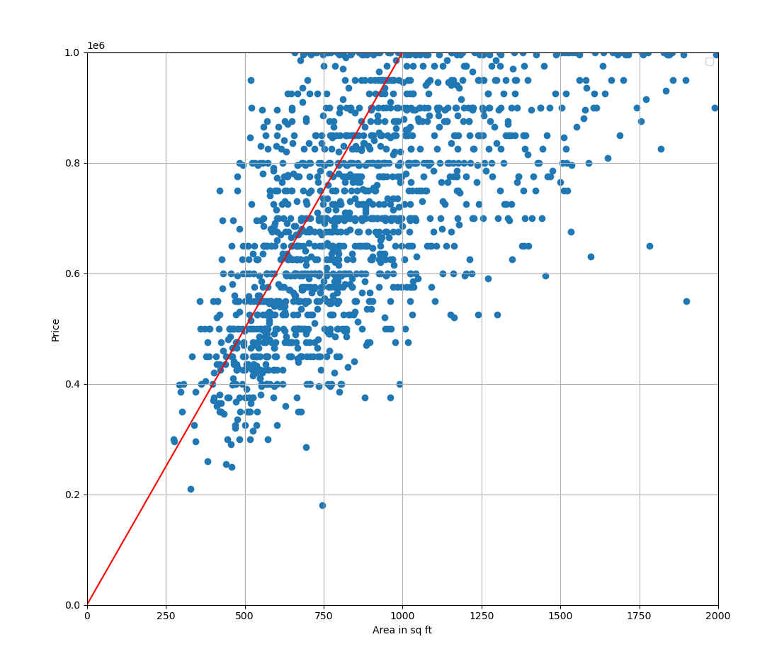
A new line with adjusted parameters.
>>> print(mse(X, Y, w, b))
233602604396.46835
That is slightly better. The error is still really large but that’s mainly due to the dataset being very widely spread and dealing with large values.
Anyway, this kind of manual labor is tedious and imprecise. Doing this algorithmically would be much better (and more fun!).
Logistic regression
Alright, linear regression is good for when you want to generate a number as an output - but that’s not always the case. What if you wanted to predict whether something belonged in a certain category?
For that, we have classification models - perhaps the simplest of which would be the model we’ll be looking at next, logistic regression.
Linear regression tried to predict a real number given a list of parameters (or features) . Logistic regression instead tries to compute the probability of the output belonging to a certain category, in this case resembled by either 0 or 1. The principle of logistic regression is to try to fit a logistic curve into a dataset. This is how it looks:
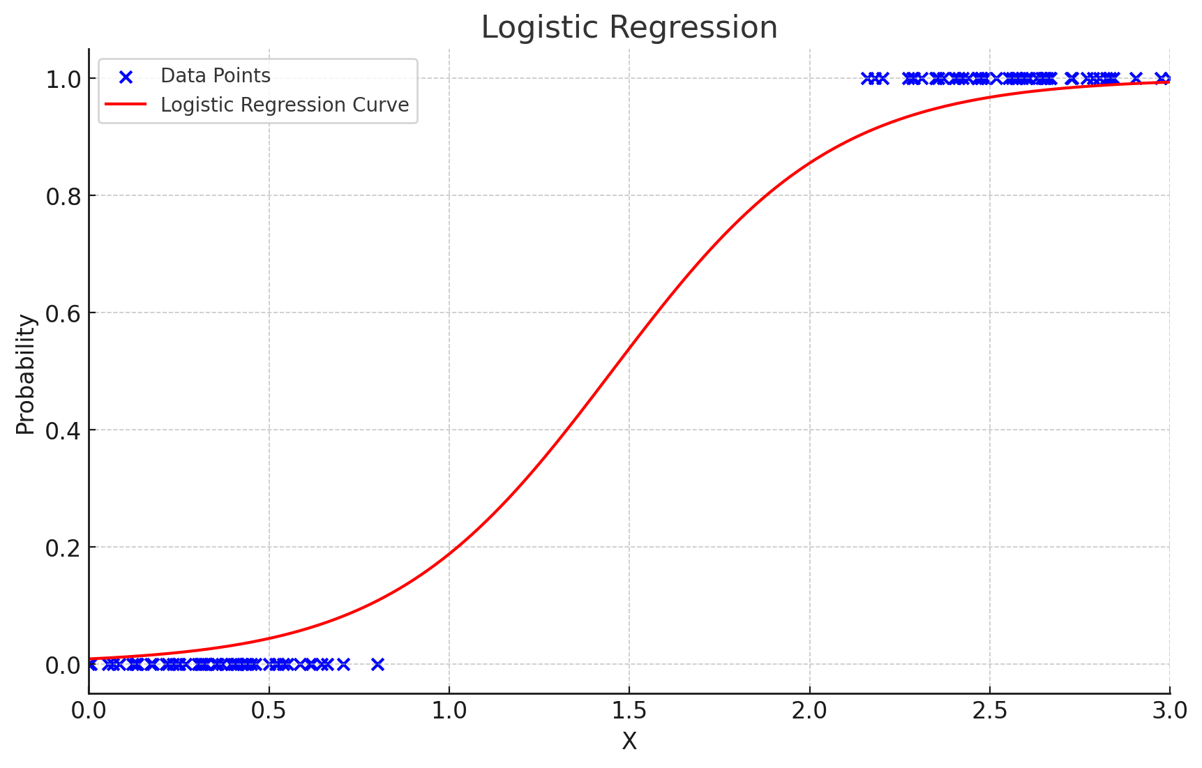
Visualization of logistic regression. (ChatGPT/matplotlib)
Let’s try to look at this with an example. Maybe the dataset could represent microwaved food. The value represents the time in the microwave in minutes, and the value represents whether the food will be sufficiently warm after being microwaved for that minutes. So here the set of output values (the categories) would be . When the time spent in the microwave is low, the food is too cold.
So for example, in the image the model predicts that after 1.5 minutes spent in the microwave, the food has roughly a 50% chance of being sufficiently warm.
Let’s get into the math part. The logistic curve is defined mathematically as
The logistic regression model expands it to:
where again, and are the parameters.
But what if you have other features too, for example the starting temperature of the food, or how much food there is on the plate? Well, as with multiple linear regression, there is an equivalent for logistic regression as well. You simply replace the term with , so we end up with:
This is called multivariate logistic regression. The reason as to why multiple linear regression is not called multivariate linear regression (which sounds cooler) is because it refers to another model, which tries to predict multiple outputs.
This was a very compact introduction. It’s a shame that most of the interesting mathematics and code is in the algorithm for finding the parameters - gradient descent. Will have to look into that eventually.